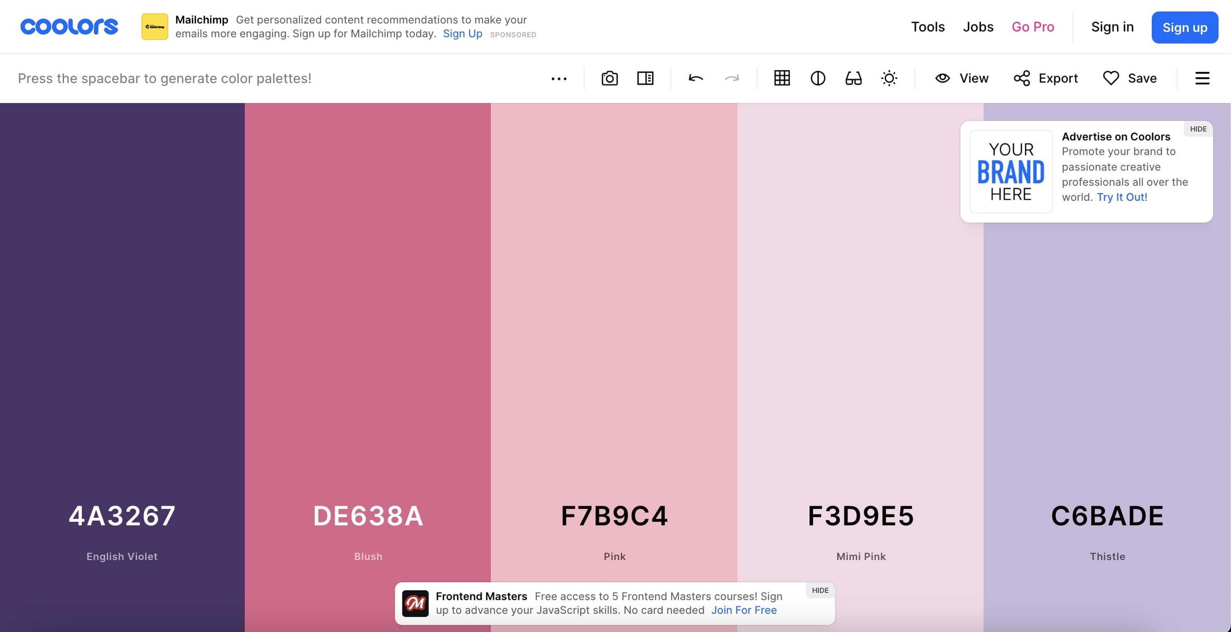
The Psychology of Color: How to Choose the Right Palette for Your Website
The psychology of color plays a crucial role in how visitors perceive and interact with your website. Different colors evoke specific emotions and can influence users’ decisions subconsciously. For instance, blue often communicates trust and reliability, making it popular among corporate and financial websites, while red can stimulate urgency and excitement, which is why it’s frequently used in clearance sales. Understanding the emotional impact of colors can help you choose a palette that aligns with your brand's message and guides users toward desired actions.
When selecting the right color palette for your website, consider the following steps:
- Identify your brand personality: Determine if your brand is more playful, professional, or innovative, and choose colors that reflect this identity.
- Research your audience: Understand the demographics and preferences of your target audience to select colors that resonate with them.
- Create harmony: Use color theory principles, such as complementary and analogous colors, to create a visually appealing and cohesive look for your site.
10 Stunning Color Combinations to Elevate Your Website Design
Choosing the right colors for your website design can profoundly impact user experience and engagement. Here are 10 stunning color combinations that can elevate your site:
- Blue and Orange - This combination is vibrant and eye-catching, perfect for tech or creative industries.
- Green and White - A calming duo ideal for health, wellness, and eco-friendly brands.
- Purple and Yellow - A bold mix that adds a sense of luxury and creativity, suitable for art-focused websites.
- Red and Black - A powerful combination that conveys strength, often used by brand identities that focus on style and sophistication.
- Teal and Coral - This refreshing pairing exudes warmth and friendliness, ideal for boutiques and personal blogs.
Aside from aesthetics, choosing the right color scheme is crucial for brand identity. Here are five more stunning combinations to consider:
- Brown and Cream - A classic and rustic choice, excellent for businesses focused on home goods and organic products.
- Turquoise and Peach - This lively mix offers a playful vibe that's perfect for lifestyle and fashion sites.
- Gray and Gold - For an elegant touch, this combo works exceptionally well in portfolios and luxury brands.
- Magenta and Cyan - A dynamic choice for entertainment and media websites, grabbing attention and excitement.
- Black and White - Timeless and versatile, providing a simple yet effective design platform for any niche.
What Color Palette Works Best for Your Brand Identity?
Choosing the right color palette for your brand identity is crucial as colors evoke emotions and associations that can significantly impact customer perception. A well-thought-out color scheme not only enhances your brand's visual appeal but also communicates its values and message. For instance, blue often symbolizes trust and dependability, making it a popular choice among financial institutions, while red can evoke excitement and passion, appealing to more adventurous brands. To determine the ideal palette, consider factors such as your target audience, industry standards, and existing brand elements.
Once you've established your primary color, you can create a cohesive look by selecting complementary colors that enhance your brand's identity. A successful approach involves choosing a dominant color, a secondary color, and a few accent colors. For example, a tech company might utilize a calming blue as its dominant color, supported by a vibrant orange or green to signify innovation and growth. Ultimately, a well-crafted color palette not only helps your brand stand out in a competitive market but also fosters an emotional connection with your audience.
