Digital Insights
Your go-to source for the latest in technology and gadget reviews.
Type and Conquer: Crafting Web Typography That Clicks
Unlock the secrets of web typography! Discover how to create stunning text that captivates and converts visitors into loyal fans.
The Art of Readability: Key Principles for Effective Web Typography
In the digital landscape, readability is paramount for engaging visitors and enhancing user experience. Effective web typography hinges on several key principles, beginning with the choice of font. The right font should be legible across various devices and sizes. Ideally, sans-serif fonts like Arial or Helvetica are suitable for on-screen reading due to their clean and simple lines. Additionally, establishing a clear hierarchy through font sizes and weights allows users to easily distinguish between headings, subheadings, and body text, creating a seamless reading experience.
Another crucial aspect of effective web typography is line spacing, or leading. Proper line spacing improves text legibility by preventing lines from appearing too cramped together. A general rule of thumb is to set the line height to about 1.5 times the font size. Furthermore, the use of adequate contrast between text and background colors plays a significant role in ensuring readability. Dark text on a light background is often recommended, as it reduces eye strain and facilitates easier scanning of content. By adhering to these principles, web designers can significantly enhance the overall readability of their sites.

Choosing the Right Typeface: A Guide to Fonts that Enhance User Experience
Choosing the right typeface is crucial for enhancing user experience on your website. Fonts are not just aesthetic choices; they play a significant role in how your content is perceived and consumed. A good typeface should not only align with your brand identity but also improve readability and accessibility. Consider factors such as font size, line spacing, and contrast to ensure that your text is legible across various devices and screen sizes.
When selecting fonts, keep the following tips in mind:
- Legibility: Choose a font that is easy to read at different sizes.
- Consistency: Use a limited number of typefaces to create a cohesive look.
- Tone: Match the font style to the emotional tone of your content to reinforce your message.
- Web-safe fonts: Opt for fonts that load quickly and are universally supported across all browsers.
How Does Typography Influence User Behavior on Websites?
Typography plays a crucial role in influencing user behavior on websites, as it affects how information is perceived and absorbed by visitors. The choice of font, size, spacing, and overall style can significantly enhance or hinder readability. For example, sans-serif fonts are often associated with modernity and simplicity, making them ideal for digital platforms. In contrast, serif fonts can evoke a sense of tradition and reliability. By creating a hierarchy through font variations, such as headings, subheadings, and body text, designers can guide users through content and highlight critical information, ultimately influencing how long users stay engaged with the site.
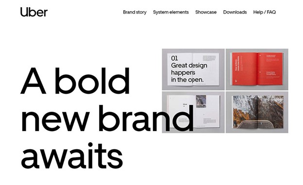
Moreover, the emotional impact of typography should not be underestimated. Different fonts can set the tone of a website and affect users' perceptions and trust levels. For instance, using bold and distinct typography can capture attention, while softer fonts may convey warmth and friendliness. A strong, consistent typographic style across a website reinforces brand identity and fosters familiarity, which can encourage repeat visits. In an age where user attention spans are dwindling, ensuring that typography is both attractive and functional can make a substantial difference in user engagement and conversion rates.